TabWidget
import { TabWidget } from "std-widgets.slint";export component Example inherits Window { width: 200px; height: 200px; TabWidget { Tab { title: "First"; Rectangle { background: orange; } } Tab { title: "Second"; Rectangle { background: pink; } } }}slint
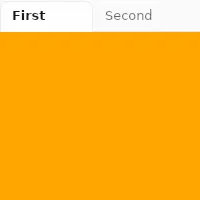
TabWidget is a container for a set of tabs. It can only have Tab elements as children and only one tab will be visible at
a time.
Properties
Section titled “Properties”current-index
Section titled “current-index” int default: 0
The index of the currently visible tab.
TabWidget {    current-index: 1;
    Tab {        title: "First";    }    Tab {        title: "Second";    }}
slint
orientation
Section titled “orientation” enum Orientation default: horizontal
The orientation of the tab bar.
When set to vertical, the tab bar is placed to the left of the content.
The property must be constant.
For example:
TabWidget { in property <Orientation> foo; // orientation: foo; // error orientation: Orientation.vertical; //valid Tab { title: "First"; }}slint
Orientation
Represents the orientation of an element or widget such as the Slider.
horizontal: Element is oriented horizontally.vertical: Element is oriented vertically.
Properties of the Tab element
Section titled “Properties of the Tab element”© 2026 SixtyFPS GmbH